Design Guidelines
1. Design Principles
1.1 Clear and concise
- Streamline hierarchy to minimize unnecessary navigation and interactions.
- Employ a coherent structure to indicate current location and offer seamless navigation paths.
1.2 Distinct hierarchy
- Clearly distinguish between primary and secondary information layers, highlighting visual focal points.
- Condense and refine content, avoiding distractions from essential decision-making factors.
1.3 Appropriate and timely
- Provide prompt feedback to prevent displaying blank or unresponsive pages.
- Inform users of abnormalities, provide status indications, and offer solutions.
1.4 Consistency and stability
- Maintain consistent interaction logic to ensure uniform actions across various pages.
- Ensure linguistic consistency, employing unified wording structure, tense, and style, throughout the system.
2. Styles
2.1 Logo
- Upload requirements
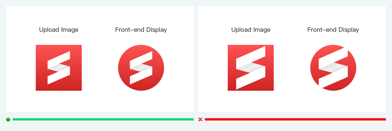
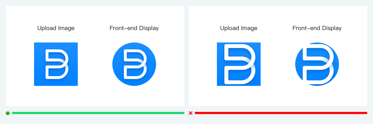
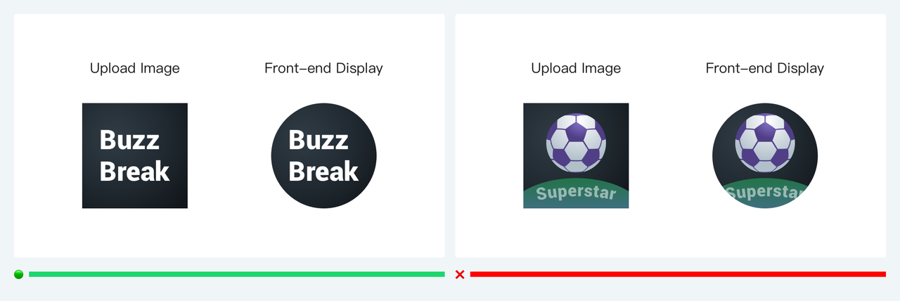
The logo will be presented in MiniApp with a circular or rounded square appearance. Clear and appropriately sized images will ensure a visually pleasing and consistent interface.
- Suggestions
The individual image size is recommended to occupy a proportion of 70%-80%.
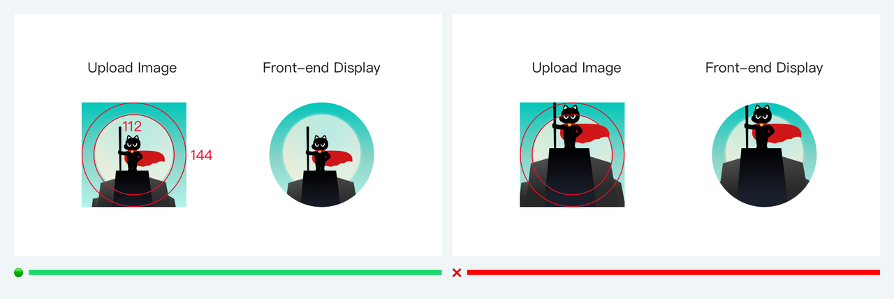
The main part should be scaled to fit within a circular area of 112*112px, avoiding any exceeding of the circular area of 144*144px.
When using graphic text for a logo, avoid placing it above or below an image.
2.2 Layout
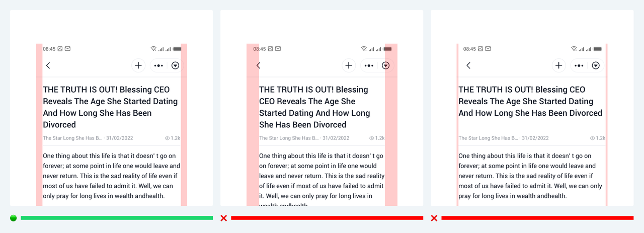
- Leave a certain amount of safe margin on both sides of the layout to ensure the readability of the page.
2.3 Color
MiniApp offers a variety of color references to ensure accurate conveyance of page information and readability. If not used, maintain color consistency and ensure accessible contrast.
- Background

- Text

- Divider
- Mask

2.4 Font
The fonts match the system fonts of the operating system. Font sizes are recommended to be even numbers, with a minimum font size of 10px and a maximum font size of 20px, increasing in increments of 2px. It's advisable to avoid using font sizes below 12px to prevent rendering issues such as misalignment between icons and text.

3. Components
3.1 Top app bar
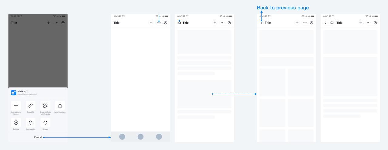
Top app bars primarily serve to indicate the current location and assist in navigating between various pages within MiniApp. It is provided by the MiniApp framework and remains fixed at the top of the screen. While some content can be customized by developers, its main purpose is to ensure consistent navigation throughout the app.
Flow
Element
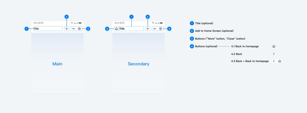
Main:
Title
Add to Home Screen
Buttons("More" button, "Close" button)
Container
Secondary:
Title
Add to Home Screen
Buttons("More" button, "Close" button)
Buttons("Back to homepage" button, "Back" button, "Back to homepage" button + "Back" button)
Container
Customization
Default values
- Container
The default background color of the container is #FFFFFF, which developers can customize. However, it's important to consider both overall readability and visual aesthetics when making customizations.
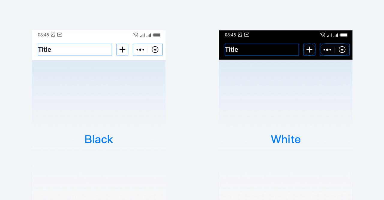
The status bar background follows the color of the container, while the status bar text and icon color can only be configured as black or white.
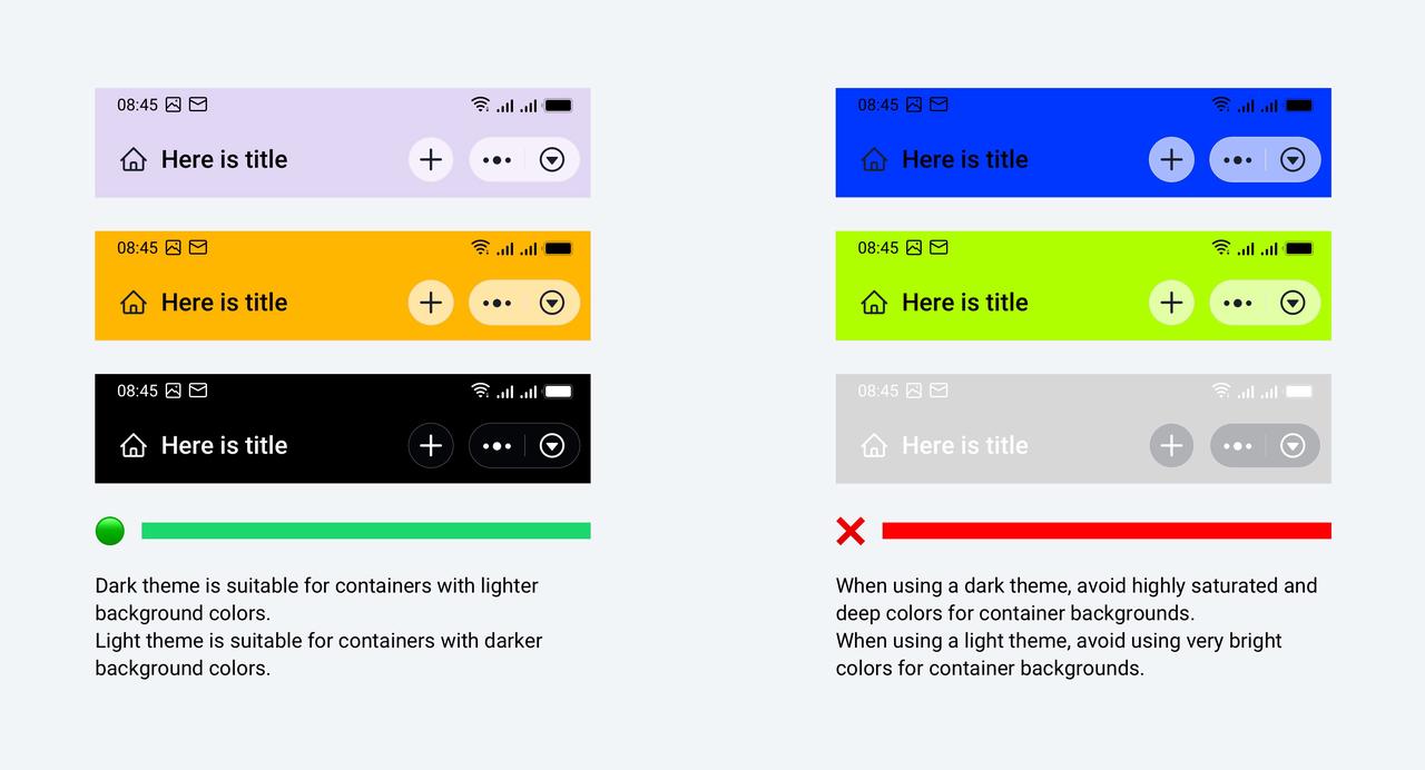
- The buttons area and page title offer two sets of color schemes: dark and light.
- Add to Home Screen
The top app bars default to displaying this button, and developers can choose whether to configure it by calling the API.
More choices
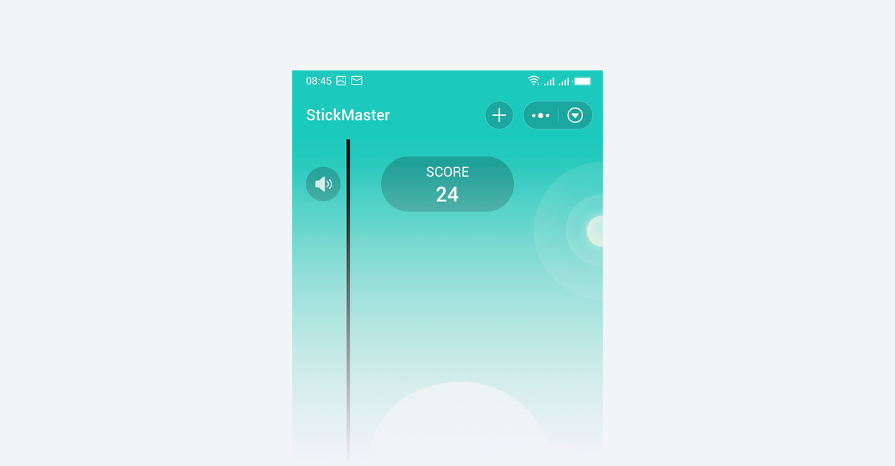
- Except for the "Close" and "More" button areas, all can be fully configured by the developers.
3.2 Navigation bar
Navigation bars let people switch between UI views on smaller devices.
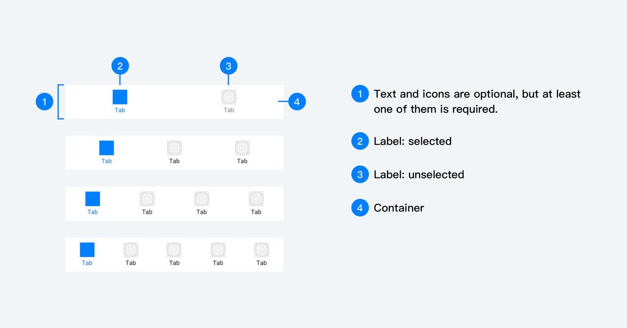
Elements
- Destinations Navigation bars provide access to three to five destinations.
- Label text Label text provides short, meaningful descriptions of navigation bar destinations.
Customization
- Container color, icon color, text color
Please use appropriate colors to distinguish between the selected and non-selected states, and design suitable background colors for the containers. When defining the tab bar style, please pay careful attention to it and ensure readability and usability.
- Icon
Icons need to be output according to the following specifications, otherwise, they may appear stretched or distorted.
File size: maximum 40KB
Size: 81*81px
Format: PNG, JPG
3.3 Dialog
Dialogs are used to notify and request user confirmation or decisions for the next steps. They interrupt the current workflow. The overlay will cover the current page, and the functionality of the original page can not be used.
Element
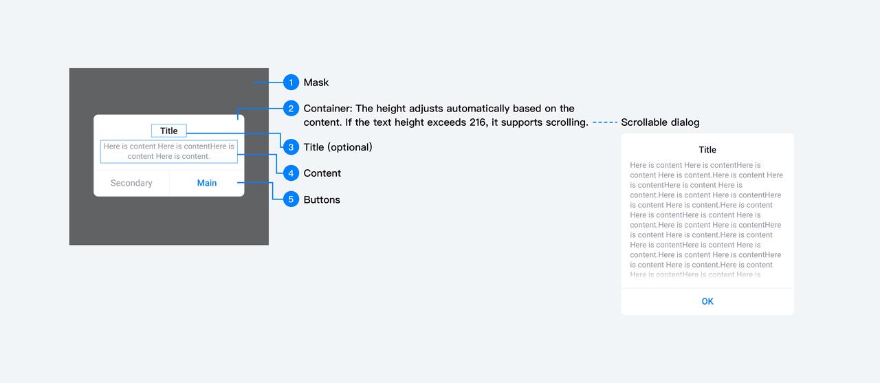
Customization
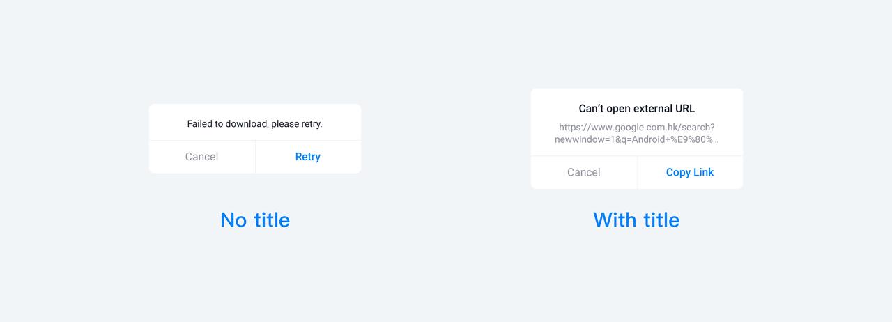
- Title
The title can be configured, and it should clearly indicate the purpose of the current dialog. The content of the body should complement the title, and it should not repeat the title copy.
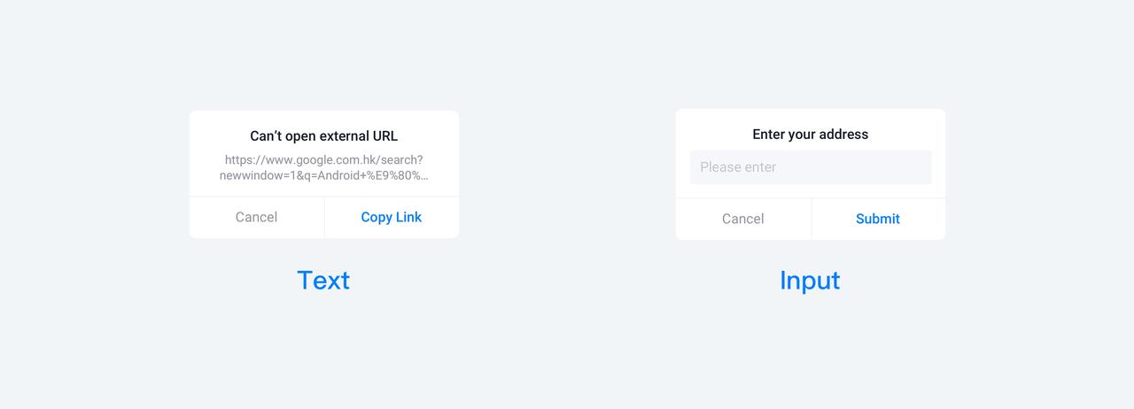
- Content
The content can be configured with text or input fields based on the actual scenario.
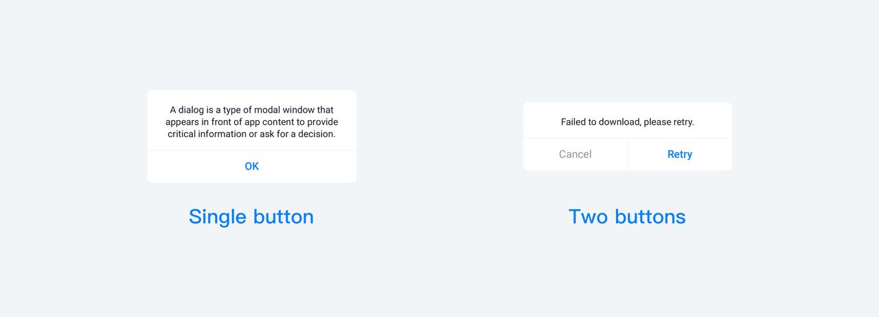
- Button color, text, buttons
The number of buttons supported is 1-2: For dual-button prompts, each button's text can have a maximum of 12 characters, and for single-button prompts, the text can have a maximum of 24 characters. Whenever possible, use specific verbs in the text. The button's text color can be customized.
Principle
- For irreversible actions, the main button's text color should use a warning color.
- The content within the dialog should not be excessively lengthy. The scrollable dialog style is typically used to provide detailed information on a specific topic.
- Whenever possible, avoid a situation where one dialog leads to another dialog.
3.4 Action sheet
Action sheets consist of a list of options a user can select from to complete an action. It is a specific type of modal popup that is triggered by user interaction. Users can utilize the action sheet to initiate specific tasks or confirm whether to proceed with potentially destructive actions.
Element
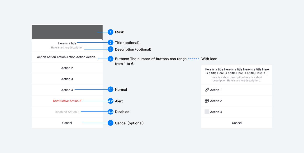
Customization
- Title and description
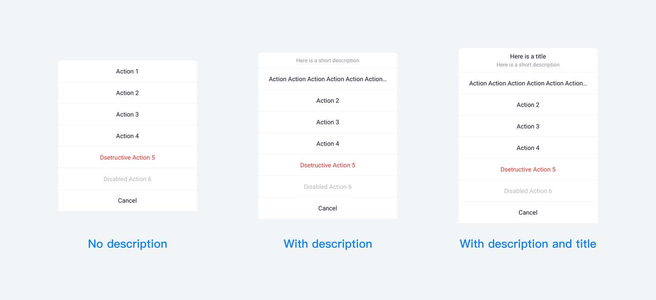
Optional title and description text for the Action Sheet. The title should clearly indicate the purpose of the current operation menu, while the description text complements the title and should not duplicate the title. Please note that it is not supported by developers to provide only a title without any description.
Button color, text
We offer standard, warning, and disabled button styles, and developers can also customize these styles. The number of buttons (excluding the cancel button) can range from 1 to 6. The content of the button text should be limited to one line, and if the text exceeds this limit, it should be automatically truncated with an ellipsis.
Icon
Developers can configure icons for the action sheet buttons. Once configured, the layout of the action options will shift from center-aligned to left-aligned.
Principle
- The "Cancel" button should always be present.
- For irreversible actions, the button text color should use a warning color.
- Avoid too many actions. If there are too many buttons, users might need to scroll to see all of them, which can increase the user's interaction cost.
3.5 Toast
Toasts provide simple feedback about an operation in a small popup.
Type
- Text: 1-2 lines of text, disappears after a fixed time.
- Text + Icon: single line with an icon
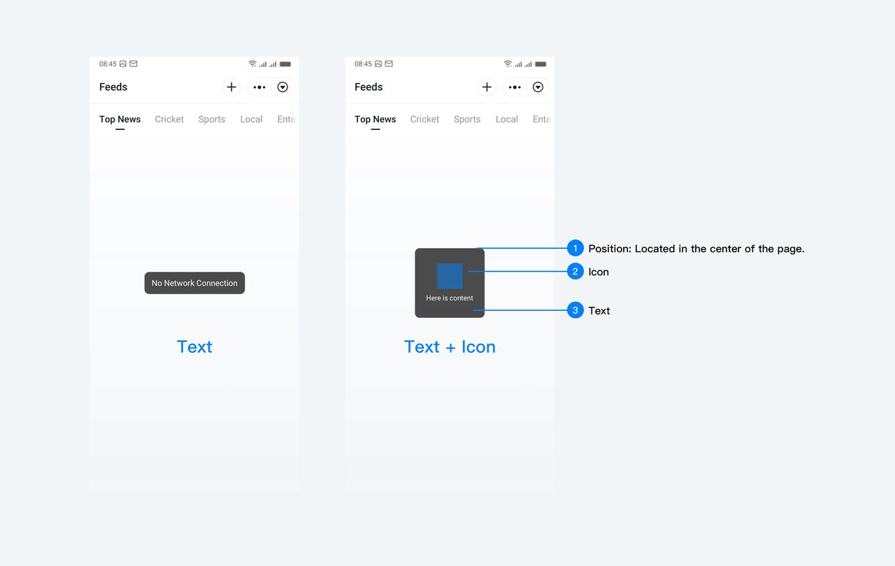
Customization
- Display Duration
The default duration is 1.5 seconds, developers can customize it.
- Icon
Provides default icons for success, failure, and loading states. Developers can use the "image" configuration to customize icons.
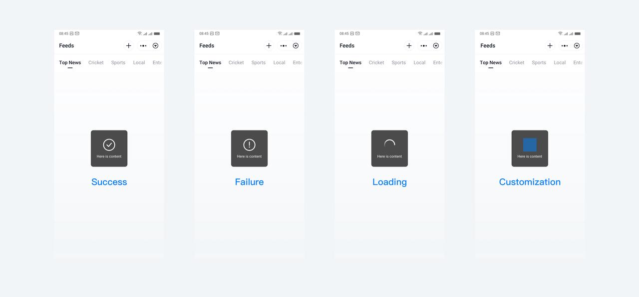
Principle
- Keep the text prompts concise to ensure users can quickly understand.
3.6 Loading, Refresh
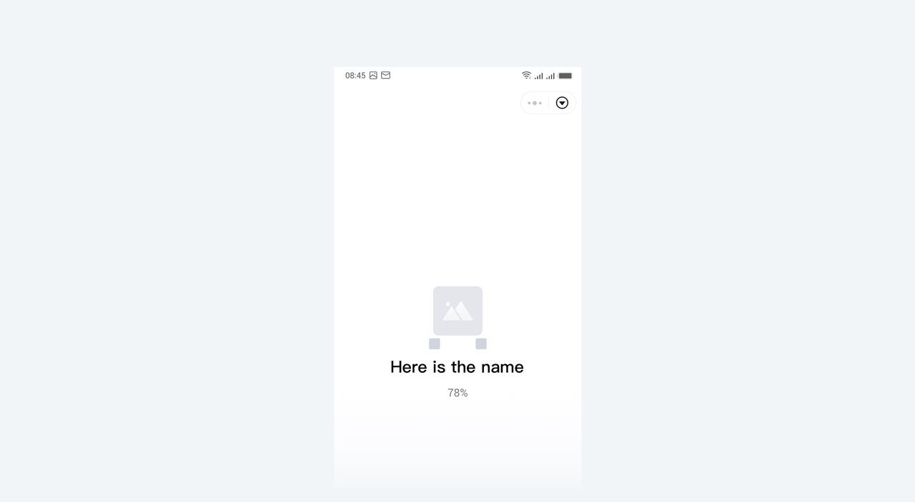
Splash page loading
- The Splash page can display the loading state while prominently featuring the logo. All content on the page, except for the logo and name, will be provided by the official source and can not be customized.
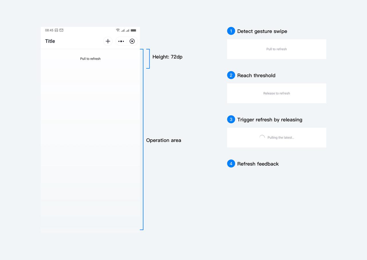
Pull-to-refresh
- We provide the pull-to-refresh component. Pulling down the page to a certain distance triggers the refresh of the current page.
Modal loading
- We provide the modal loading component.
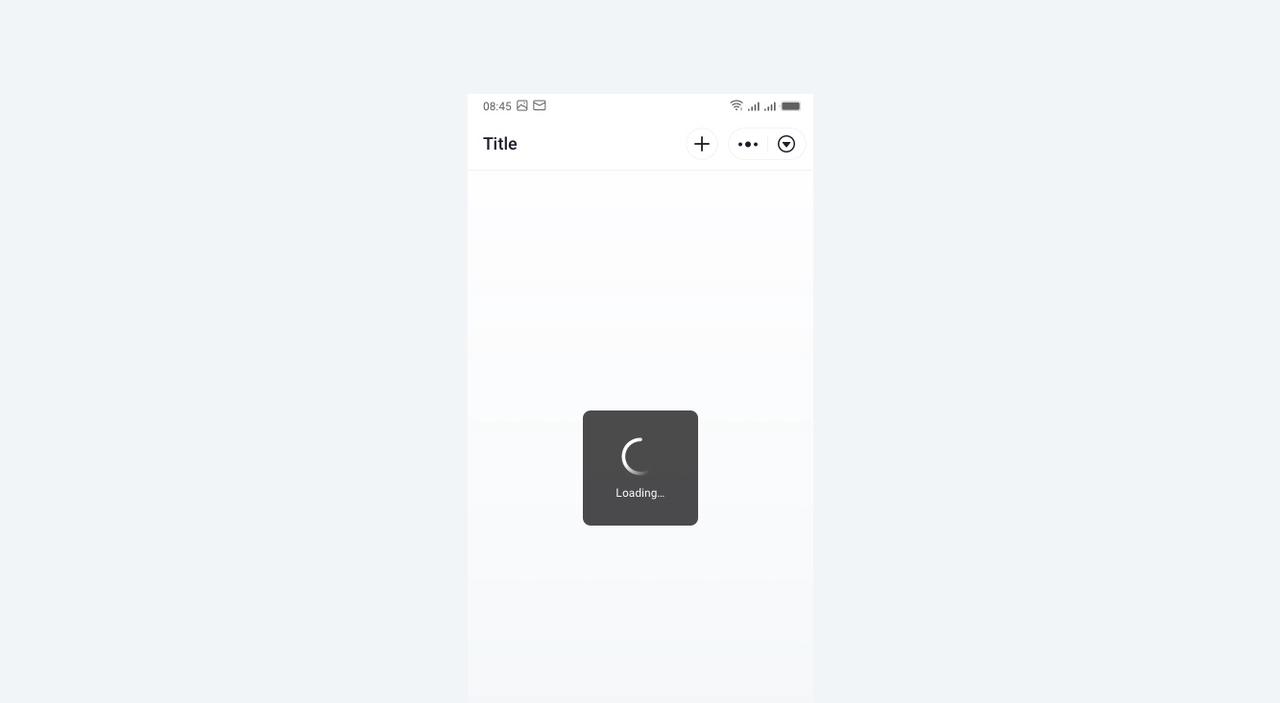
- Modal loading will render the current interface inaccessible for any operation except returning or closing. This ensures that the ongoing task remains uninterrupted.
